Riot Games Account Management 2.0
Legacy systems can become overly expensive to maintain and complicate creating new, best in class user features. To bring align the needs of Riot's players and business goals, I used deep research and insights for a scalable path forward for a format simultaneously improving the user experience and operation costs.
Company
Riot Games - Player Experience
Role
Senior UX Designer

Riot Games Account Management 2.0
Legacy systems can become overly expensive to maintain and complicate creating new, best in class user features. To bring align the needs of Riot's players and business goals, I used deep research and insights for a scalable path forward for a format simultaneously improving the user experience and operation costs.
Company
Riot Games - Player Experience
Company
Riot Games - Player Experience
Role
Sr UX Designer
Role
Sr UX Designer

Problem Statement
Problem Statement
Problem Statement
What are the challenges with the current system?
Account Management features were built vertically, a single page with every service being called whenever a user visited that page. This was due to lots of legacy code and became increasingly cumbersome.
While leading multiple projects, I ran into issues requiring a pivot to a less than ideal outcome.
The vertical structure was inefficient, expensive, and a headache for our engineers.
Features lacked any organization reflecting user goals.
The experience on mobile devices were odd and had usability issues.
Without addressing the core problem (overall architecture) we'd repeat the same frustrating cycle.
Redesigning the entire structure NOW, was a path to creating a net positive for both user goals and the business bottom line. It would reduces costs and unlock new feature capabilities.
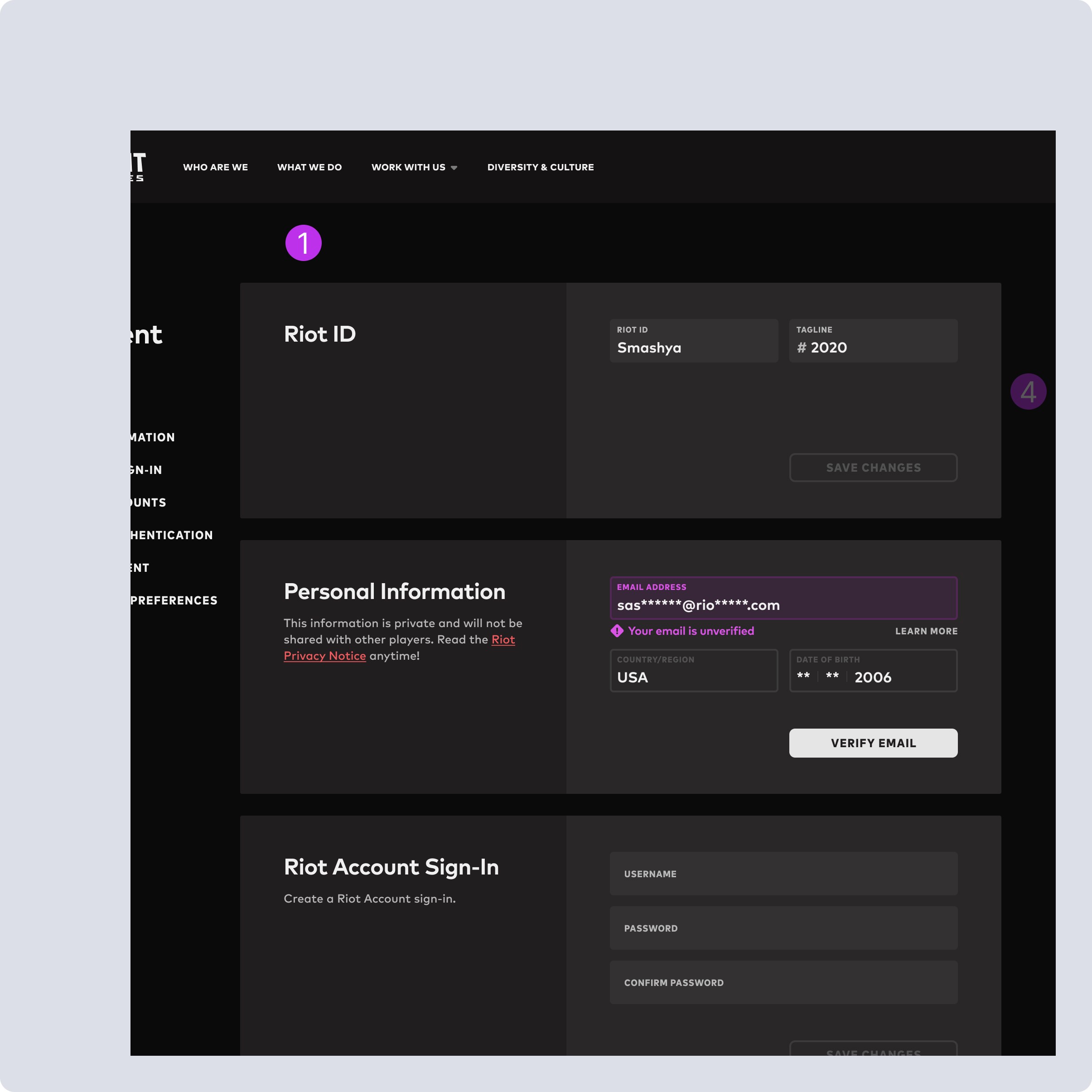
Overall Structure - Single page vertical layout, which means regardless of user intent, anytime they visit the page, or make changes, all services are called. This is inefficient, unscalable and expensive, and impedes the ability to develop new features to add value.
(1 of 4)
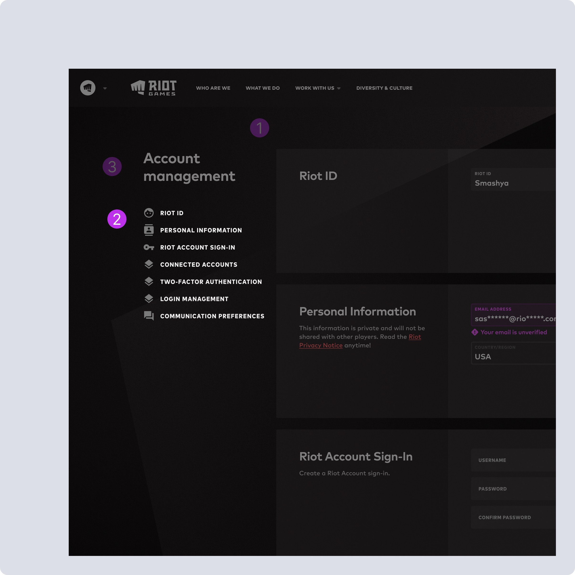
Feature Organization - These features need to be organized by a mix of user intent and system requirements to reduce costs. Only showing the user what they are intending to access will greatly improve costs now, let alone in the long run.
(2 of 4)
Accessibility / Headers We need to create new individual groupings for these features. Updating the responsive design will need to address the repetition of this as the page header, particularly as features are broken out into individual account management pages.
(3 of 4)
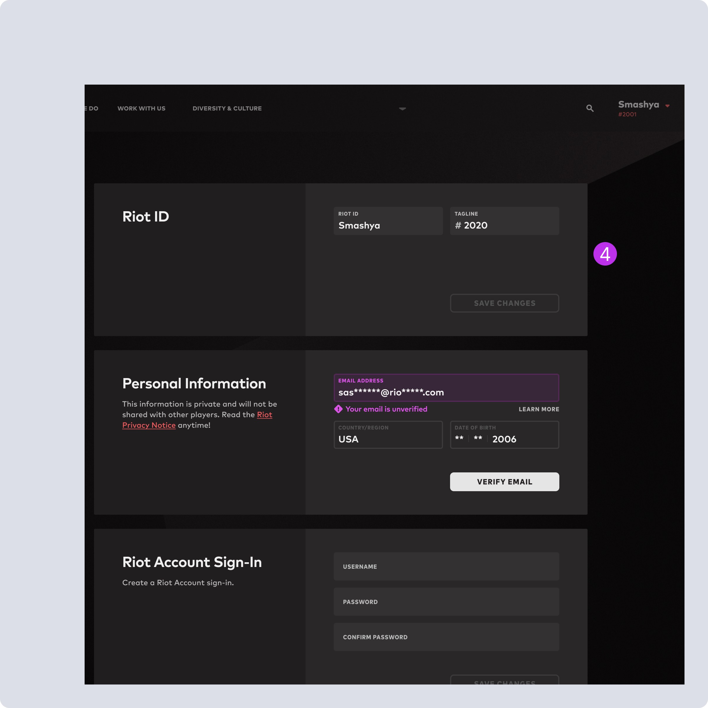
Feature UI - These are a relic of past simplicity and don’t provide any flexibility outside of what’s here, and are intrinsically tied to their functionality. So making ANY changes need to be well planned to retain live functionality without breaking user capabilities.
(4 of 4)
Overall Structure - Single page vertical layout, which means regardless of user intent, anytime they visit the page, or make changes, all services are called. This is inefficient, unscalable and expensive, and impedes the ability to develop new features to add value.
(1 of 4)
Feature Organization - These features need to be organized by a mix of user intent and system requirements to reduce costs. Only showing the user what they are intending to access will greatly improve costs now, let alone in the long run.
(2 of 4)
Accessibility / Headers We need to create new individual groupings for these features. Updating the responsive design will need to address the repetition of this as the page header, particularly as features are broken out into individual account management pages.
(3 of 4)
Feature UI - These are a relic of past simplicity and don’t provide any flexibility outside of what’s here, and are intrinsically tied to their functionality. So making ANY changes need to be well planned to retain live functionality without breaking user capabilities.
(4 of 4)
Responsive / Mobile Experience
Responsive / Mobile Experience
Responsive / Mobile Experience
Navigation Usability
When menu is open, feels weird to remain open and allow user to scroll the content behind it. Moving the close button to the bottom feels unexpected and awkward.
Can move header icons next to the text, which would align with desktop experience and open up potential of adding dropdowns if needed in the future.
Scope vs Value
Scope vs Value
Scope vs Value
How to get the most value now, and what needs to be delayed?
This was a complicated project which required lots of organization and understanding what I could do without breaking live features or bloating scope.
Focusing on structural changes to improve scalability was a result of stakeholder alignment.
I mapped out functionality to understand how everything worked, where the challenges would come from, and how far things could be pushed now.
Through conversations I was able to drive additional regional alignment, bringing one unique stakeholder into the conversation, to reduce future engineering and design debt.
Weighing value-to-friction, a big UI overhaul was deemed out of scope for initial work.
Solutions via Research
Solutions via Research
Solutions via Research
A redesign to reflect market expectations and our users.
Market Research
To get a broad but targeted understanding that covered enough expectations, I did a full breakdown of specific competition to properly craft solutions for OUR users.
Google
XBox/Microsoft
Playstation
Discord
Battlenet
A redesign to reflect market expectations and our users.
Market Research
To get a broad but targeted understanding that covered enough expectations, I did a full breakdown of specific competition to properly craft solutions for OUR users.
Google
XBox/Microsoft
Playstation
Discord
Battlenet
A redesign to reflect market expectations and our users.
Market Research
To get a broad but targeted understanding that covered enough expectations, I did a full breakdown of specific competition to properly craft solutions for OUR users.
Google
XBox/Microsoft
Playstation
Discord
Battlenet
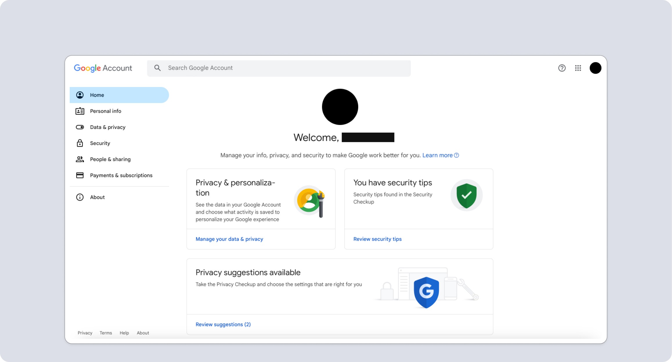
Google - Home Page was very much about the user, but places like subscription differed than our use case. Plus as an auth provider their external accounts/security would differ.
(1 of 2)
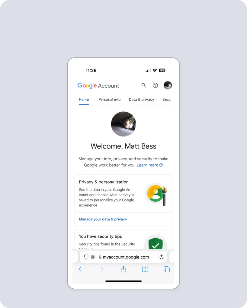
While tabs feel like a clean and usable way to organize our feature buckets, they would cause scalability problems for us when we localize.
(2 of 2)
Google - Home Page was very much about the user, but places like subscription differed than our use case. Plus as an auth provider their external accounts/security would differ.
(1 of 2)
While tabs feel like a clean and usable way to organize our feature buckets, they would cause scalability problems for us when we localize.
(2 of 2)
Microsoft / XBox
Microsoft / XBox
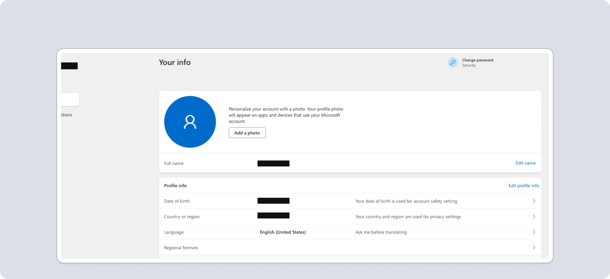
Features are laid out in cards, but editing pops a modal instead of inline adjustments. Design overall is very utilitarian, reflecting an auth provider product with features that expand past gaming.
(1 of 2)
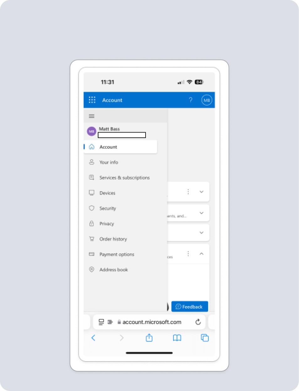
Double menu to account for complexity, and number of features. Pop out menu is clean, and content behind it isn't accessible, but closes menu, which is an improvement on current Riot experience.
(2 of 2)
Microsoft / X-Box
Features are laid out in cards, but editing pops a modal instead of inline adjustments. Design overall is very utilitarian, reflecting an auth provider product with features that expand past gaming.
(1 of 2)
Double menu to account for complexity, and number of features. Pop out menu is clean, and content behind it isn't accessible, but closes menu, which is an improvement on current Riot experience.
(2 of 2)
Sony / Playstation
Sony / Playstation
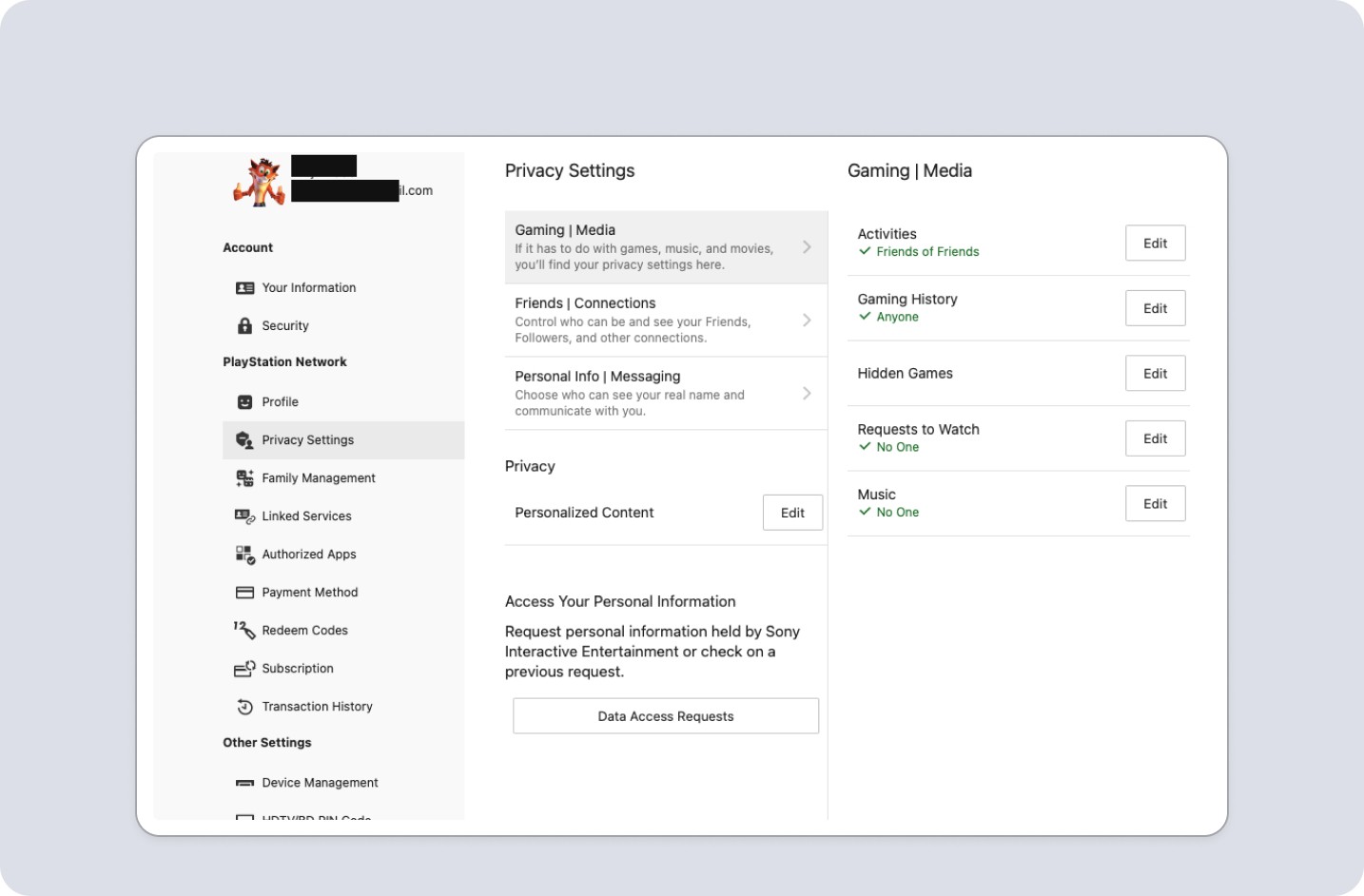
Playstation frequently uses modals or kick outs to unique pages, which we try to minimize as they are overkill for our users. Update validations don't provide context to changes. Responsive experience feels different on mobile.
(1 of 2)
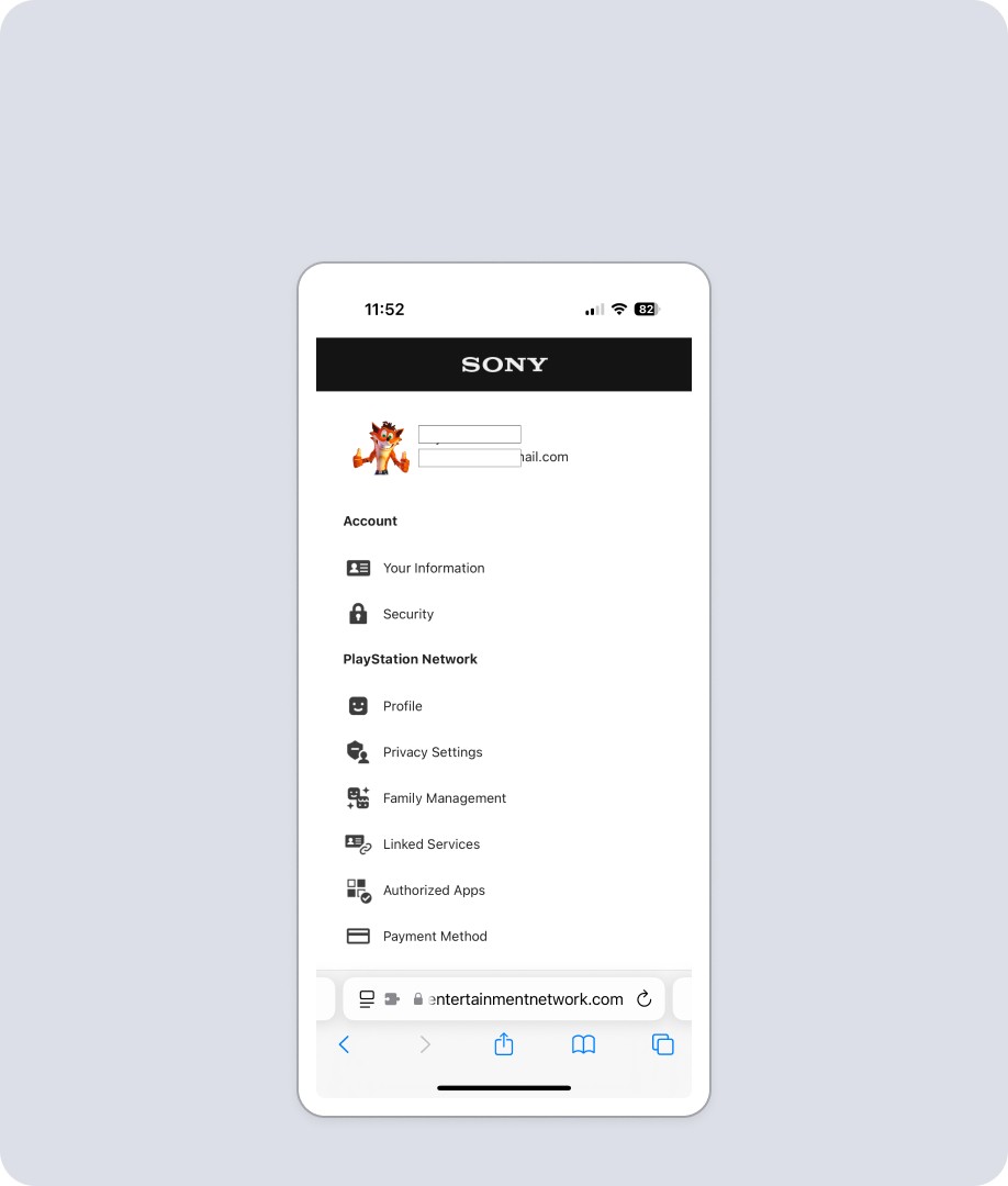
On Mobile, Menu is main landing spot, value being services are hyper targeted task driven, and otherwise wouldn’t load. Recreating that for Riot is overkill with too much friction. Doesn’t have any close mechanism, which feels potentially odd.
(2 of 2)
Playstation frequently uses modals or kick outs to unique pages, which we try to minimize as they are overkill for our users. Update validations don't provide context to changes. Responsive experience feels different on mobile.
(1 of 2)
On Mobile, Menu is main landing spot, value being services are hyper targeted task driven, and otherwise wouldn’t load. Recreating that for Riot is overkill with too much friction. Doesn’t have any close mechanism, which feels potentially odd.
(2 of 2)
Discord
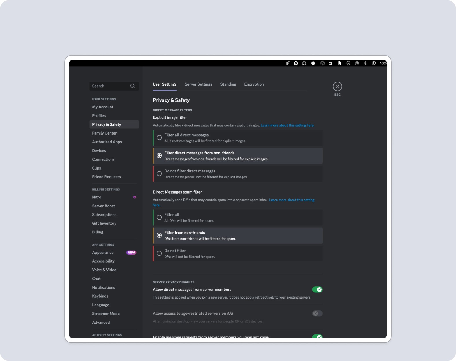
Good use of inline editing with radio buttons to individualize options, and toggle for on off functionality. Good example of how to control social functions, and what should be at a global vs game level.
(1 of 2)
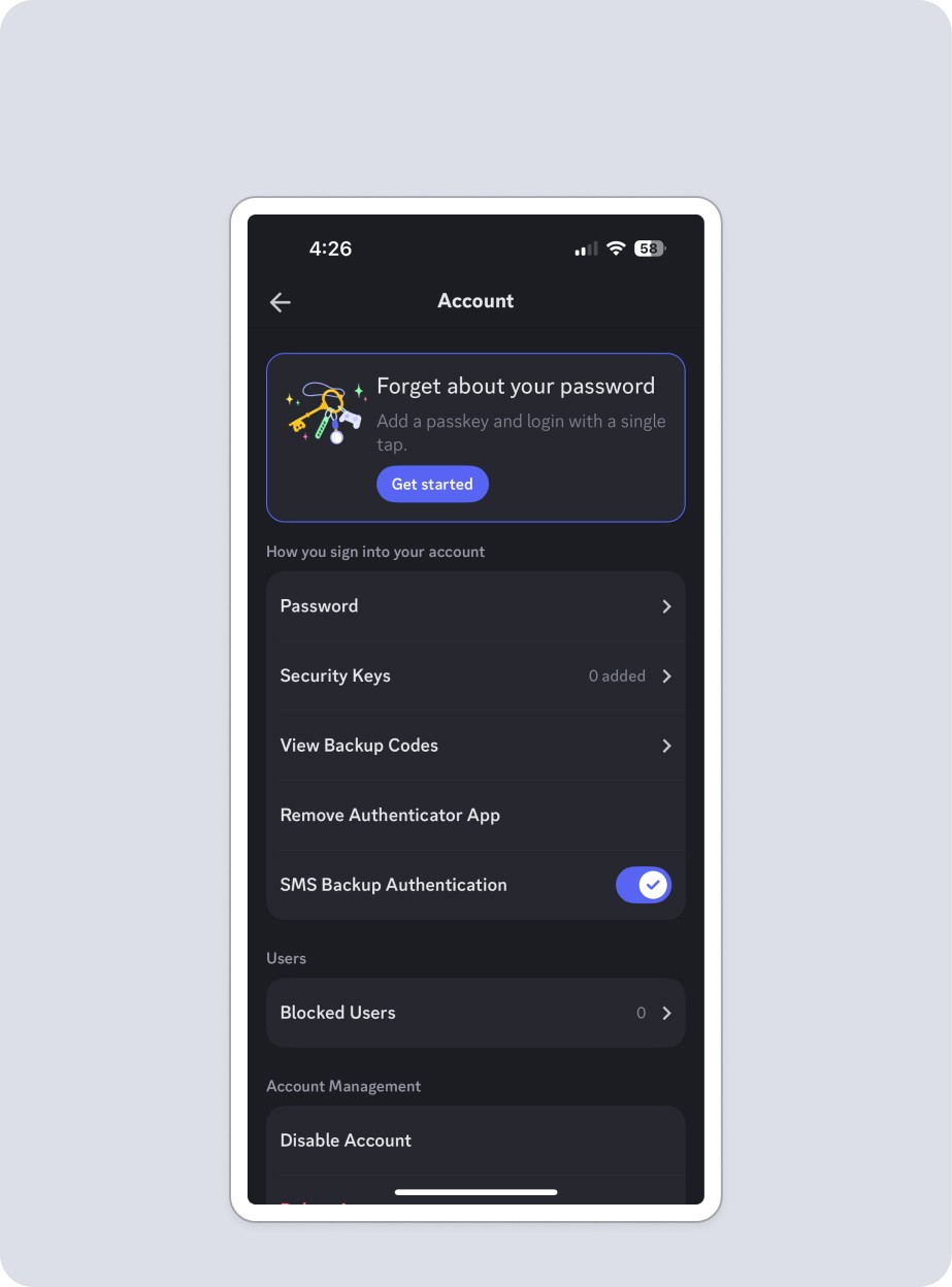
Editing is hyper organized into folders, and each time you make a selection it opens a new page. This requires heavy use of back button to navigate and a bit cumbersome for users. It's also a native app, not responsive mobile.
(2 of 2)
Battlenet
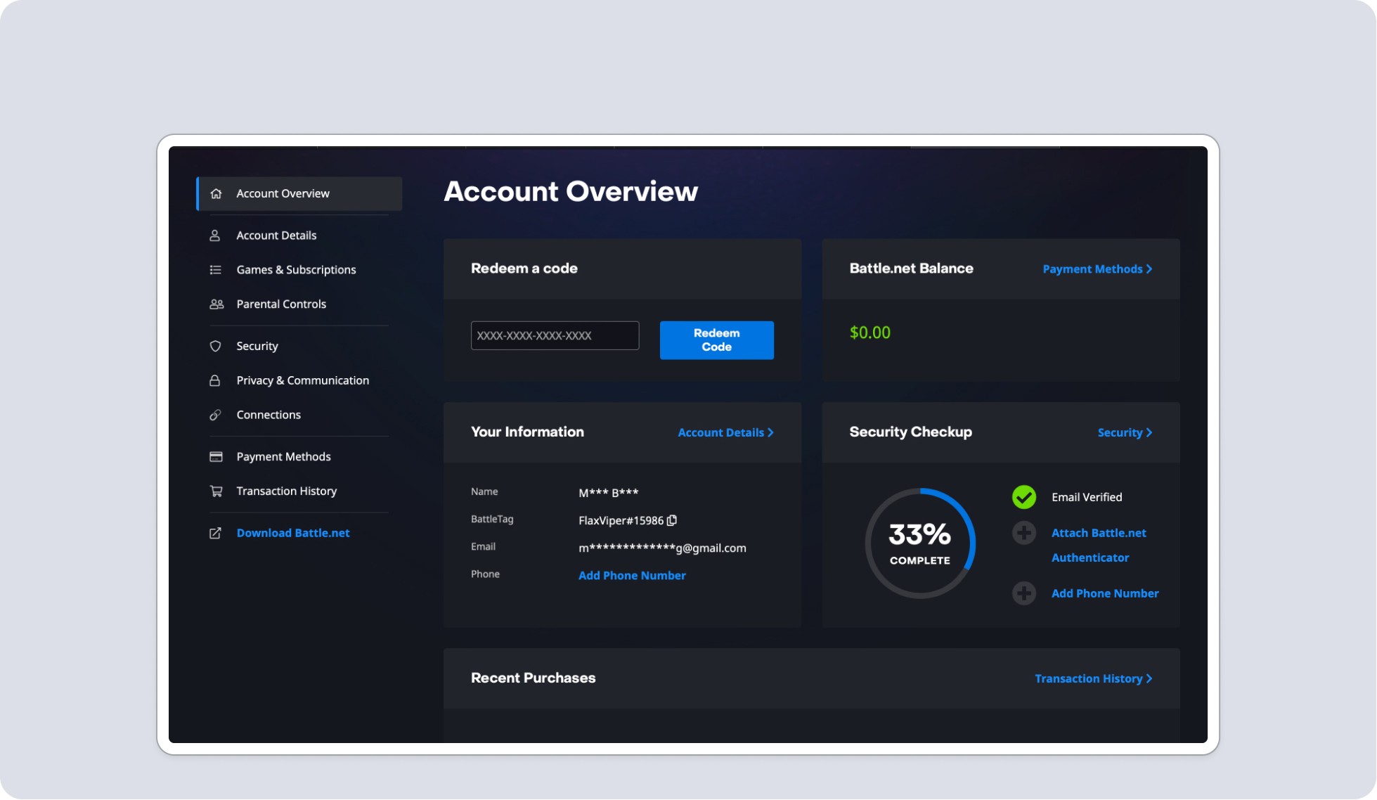
Battlenet included a main page hub with lots of functionality, which was something that was a potential future for us. Their organization also mapped well to ours, with clear validation and inline editing.
(1 of 2)
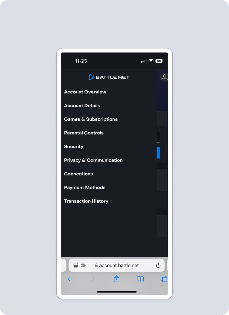
Mobile accounts pages are separate and individualized. Battlenet logo takes you back to main page, and accessing features slide in from the left. Users can only access one menu section at a time, creating simplicity and clarity.
(2 of 2)
Discord
Discord
Good use of inline editing with radio buttons to individualize options, and toggle for on off functionality. Good example of how to control social functions, and what should be at a global vs game level.
(1 of 2)
Editing is hyper organized into folders, and each time you make a selection it opens a new page. This requires heavy use of back button to navigate and a bit cumbersome for users. It's also a native app, not responsive mobile.
(2 of 2)
Battlenet
Battlenet
Battlenet included a main page hub with lots of functionality, which was something that was a potential future for us. Their organization also mapped well to ours, with clear validation and inline editing.
(1 of 2)
Mobile accounts pages are separate and individualized. Battlenet logo takes you back to main page, and accessing features slide in from the left. Users can only access one menu section at a time, creating simplicity and clarity.
(2 of 2)
Sony / Playstation
Sony / Playstation
Playstation frequently uses modals or kick outs to unique pages, which we try to minimize as they are overkill for our users. Update validations don't provide context to changes. Responsive experience feels different on mobile.
(1 of 2)
On Mobile, Menu is main landing spot, value being services are hyper targeted task driven, and otherwise wouldn’t load. Recreating that for Riot is overkill with too much friction. Doesn’t have any close mechanism, which feels potentially odd.
(2 of 2)
Google - Home Page was very much about the user, but places like subscription differed than our use case. Plus as an auth provider their external accounts/security would differ.
(1 of 2)
While tabs feel like a clean and usable way to organize our feature buckets, they would cause scalability problems for us when we localize.
(2 of 2)
Discord
Discord
Good use of inline editing with radio buttons to individualize options, and toggle for on off functionality. Good example of how to control social functions, and what should be at a global vs game level.
(1 of 2)
Editing is hyper organized into folders, and each time you make a selection it opens a new page. This requires heavy use of back button to navigate and a bit cumbersome for users. It's also a native app, not responsive mobile.
(2 of 2)
Microsoft / XBox
Microsoft / XBox
Features are laid out in cards, but editing pops a modal instead of inline adjustments. Design overall is very utilitarian, reflecting an auth provider product with features that expand past gaming.
(1 of 2)
Double menu to account for complexity, and number of features. Pop out menu is clean, and content behind it isn't accessible, but closes menu, which is an improvement on current Riot experience.
(2 of 2)
Battlenet
Battlenet
Battlenet included a main page hub with lots of functionality, which was something that was a potential future for us. Their organization also mapped well to ours, with clear validation and inline editing.
(1 of 2)
Mobile accounts pages are separate and individualized. Battlenet logo takes you back to main page, and accessing features slide in from the left. Users can only access one menu section at a time, creating simplicity and clarity.
(2 of 2)
User Research
I also crafted a survey for our players to understand their goals and expectations. Alongside one of our researchers, the questions were refined, sent out, then results were analyzed.
The data was fairly clear and provided data points to make decisions.
User Research
I also crafted a survey for our players to understand their goals and expectations. Alongside one of our researchers, the questions were refined, sent out, then results were analyzed.
The data was fairly clear and provided data points to make decisions.
User Research
I also crafted a survey for our players to understand their goals and expectations. Alongside one of our researchers, the questions were refined, sent out, then results were analyzed.
The data was fairly clear and provided data points to make decisions.
40%
Personal / Profile Info
40%
Account Info / Settings
RiotID (Equivalent to Username / In Game Name) - Most users would place this in one of two locations, which made sense.
(1 of 2)
30%
Personal / Profile or Account Settings
20%
Security or User Info
Password - This was the one with the biggest disparity of views, but even then results fell into generally expected areas. We also would need this in the section of the username card.
(2 of 2)
40%
Personal / Profile Info
40%
Account Info / Settings
RiotID (Equivalent to Username / In Game Name) - Most users would place this in one of two locations, which made sense.
(1 of 2)
30%
Personal / Profile or Account Settings
20%
Security Or User Info
Password - This was the one with the biggest disparity of views, but even then results fell into generally expected areas. We also would need this in the section of the username card.
(2 of 2)
Mobile Usability
Mobile Usability
Mobile Usability
What isn't working, and what needs improving?
Looking at the current experience a few things were clear, and outlining those allowed targeted fixes.
Menu dropdown caused usability issues.
The design reflected the current vertical build and would need to be overhauled to reflect the changes to organization.
Some UI shifted around when the menu state changed, which could create user confusion
Tap to open menu dropdown. Menu Bar label changes with scrolling, and act as hyperlinks to content.
(1 of 5)
"Account Management" is H1 Header, and scrolls with the content going under the menu.
(2 of 5)
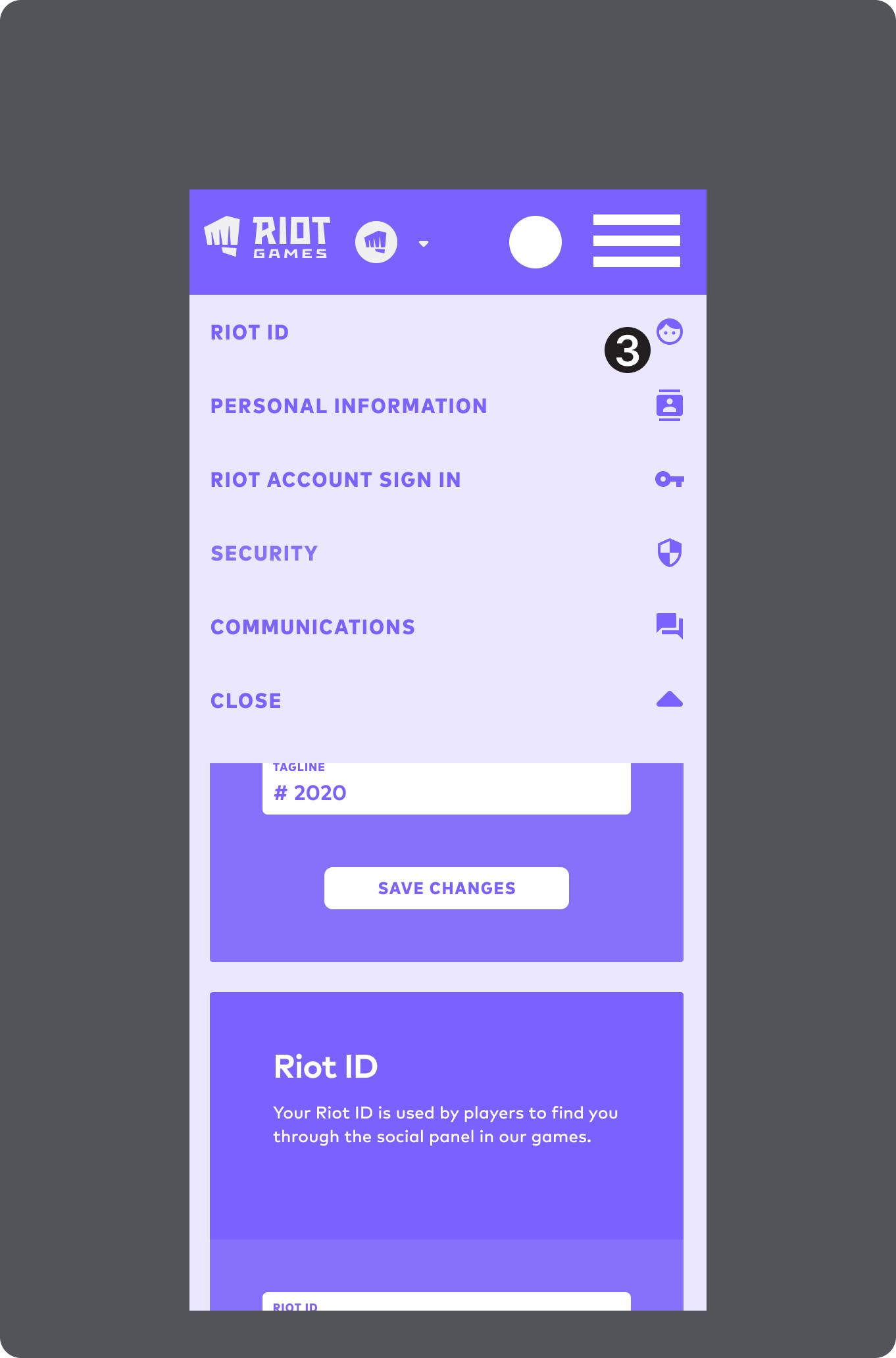
Icons are moved to the right side, presumably to take up space, but creating unnecessary experience drift from desktop.
(3 of 5)
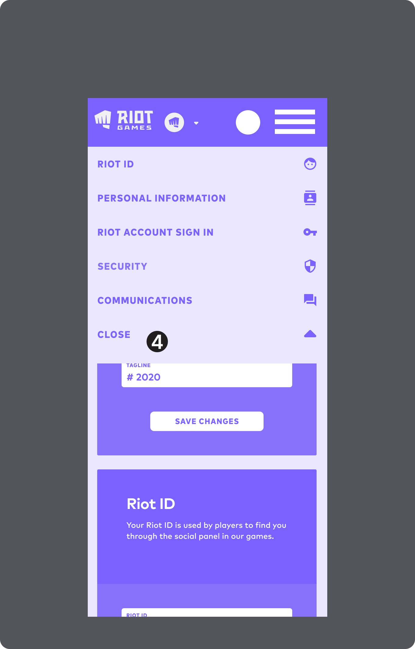
Close button is at bottom of the menu, and gets lost in the visuals
(4 of 5)
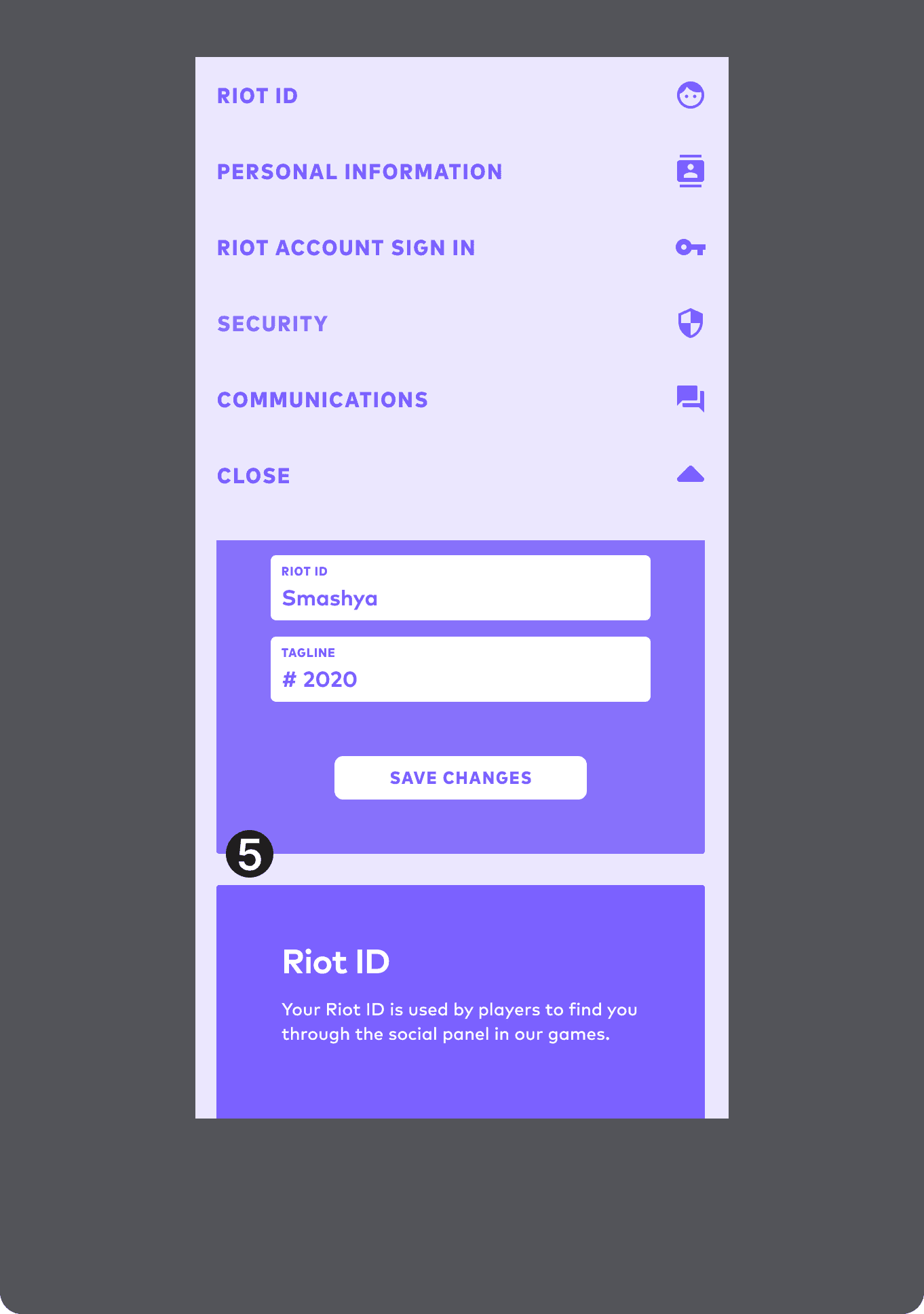
Content cards are still accessible when scrolling under the open menu.
(5 of 5)
Tap to open menu dropdown. Menu Bar label changes with scrolling, and act as hyperlinks to content.
(1 of 5)
"Account Management" is H1 Header, and scrolls with the content going under the menu.
(2 of 5)
Icons are moved to the right side, presumably to take up space, but creating unnecessary experience drift from desktop.
(3 of 5)
Close button is at bottom of the menu, and gets lost in the visuals
(4 of 5)
Content cards are still accessible when scrolling under the open menu.
(5 of 5)
Testing & Iterating Toward Solutions
Several versions were tested, with small changes between them, particularly since certain versions (aka tab dividers like Google) weren't viable options.
In tandem with the new IA there would need to be a better way to scale how to identify sections from how they are shown in the current version.
Small changes like creating more clarity around the current and newly selected section would help the user better identify where they are and where they're going.
Making the dropdown modal work properly vs the current experience, was another simple fix that wouldn't bloat the scope.
The right usability improvements emerged early, better identifying the current and requested new selections. IA improvements required a nuanced progression to find the right solution. In this first pass, I tried a simplified version just having "menu" as the button title.
(1 of 4)
The functionality of the menu selector was fairly clear, so this version tried to clarify the current section using the section title in the menu dropdown, making it clear to the user at all times.
(2 of 4)
Making the Account Management label smaller made sense given it's a consistent H1, but less important than the actual feature. This attempt combined the previous two options in the button, including menu and the current section.
(3 of 4)
This final version was a product of comments and suggestions during testing. It allowed for the Account Management H1 to always be available, as well as the current section, but in a more nuanced, happy medium version of other options.
(4 of 4)
Testing & Iterating Toward Solutions
Several versions were tested, with small changes between them, particularly since certain versions (aka tab dividers like Google) weren't viable options.
In tandem with the new IA there would need to be a better way to scale how to identify sections from how they are shown in the current version.
Small changes like creating more clarity around the current and newly selected section would help the user better identify where they are and where they're going.
Making the dropdown modal work properly vs the current experience, was another simple fix that wouldn't bloat the scope.
The right usability improvements emerged early, better identifying the current and requested new selections. IA improvements required a nuanced progression to find the right solution. In this first pass, I tried a simplified version just having "menu" as the button title.
(1 of 4)
The functionality of the menu selector was fairly clear, so this version tried to clarify the current section using the section title in the menu dropdown, making it clear to the user at all times.
(2 of 4)
Making the Account Management label smaller made sense given it's a consistent H1, but less important than the actual feature. This attempt combined the previous two options in the button, including menu and the current section.
(3 of 4)
This final version was a product of comments and suggestions during testing. It allowed for the Account Management H1 to always be available, as well as the current section, but in a more nuanced, happy medium version of other options.
(4 of 4)
Final Outcomes
Final Outcomes
Final Outcomes
What was the result?
There were incredible challenges to fully complete this project due to roadmap considerations, and the considerable engineering effort and cross team alignment required to deconstruct then rebuild the entire system. So any metrics currently lie in the data that drove the decisions.
Having already launched the internal developer system MVP focused on creating wide system scalability, I had unique insights into the value of tackling this redesign.
It's clear that once released this will be a mutually beneficial outcome to both player experiences and the company bottom line. Not only with usability and reduced API costs, but handling those will unlock the companies abilities to more efficiently build experiences that increase player value.
It also highlights the longer companies put off making their systems efficient and scalable, the more challenging and expensive that work becomes.


