Cinema Makeup School Redesign
1
Overview
Inward Eleven hired me to rethink the UX on CMS’s existing wordpress site. It needed a more modern design aesthetic, and better optimization for mobile and responsive web users.
Role
- UX Designer
Delivered
- Low-fi Wireframes
Tools Used
- Figma
2
Previous Layout
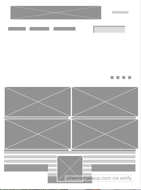
Initial Research
We dug into the existing SEO to understand how the site was working for existing users. The client researched sights as potential reference points, which we walked through and used to create initial ideas how to implement some changes.
3
Problems To Solve
Meeting with the client, we discussed specific elements to change.
Clean Design
Bring up to date to match current trends
Information Architecture
Redesign & reorganize menu to reduce clutter and optimize it for mobile.
Selling The School and Images
Rethink visual ability to sell their instructors, who their graduates are, and what they’ve done.
Data Input
Often students contact the school and research them years ahead of potential enrollment. Can we make it easier for prospective students to input contact information, so the school could keep in contact with them.
The proposed changes would be delivered with mobile/tablet/desktop mocks.
4
Design Solutions
Overall Redesign
Some of the key pages I redesigned included landing, forms, and instructors. More spacing was added throughout, and a grid system was inplemented.
Mobile Optimization
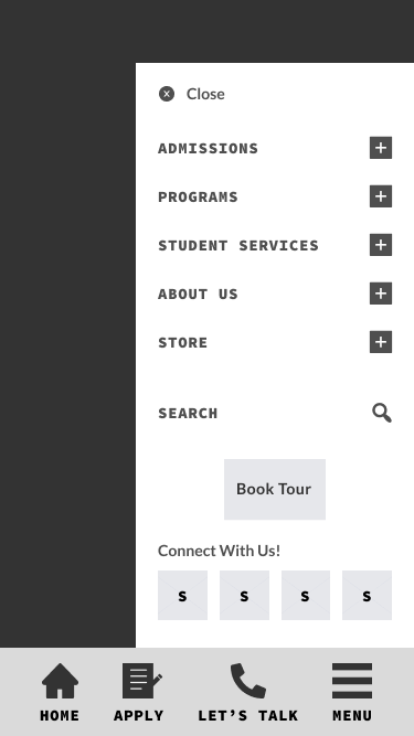
70% of users are on mobile devices, catering to them first was key. In place oftyping, to ease data input I designed click wheels and drop down forms.
Research (and common sense) shows users fingers and hands primarily at the bottom of a phone. To ease user discomfort I created a bottom static menu, including direct links via icons to the primary actions (home, apply etc).
Information Architecture
I reorganized and streamlined repetitive information, and replaced a dissapearing tab system with one where information more easily accesible.
Chart sections were set up so the visual designer could create a dynamic representation of the alumni success.
Images/Videos
The school sells a visual medium, so these needed to be bold. Edge to edge mobile images were created for still images of the faculty, and course videos. The new grid system included heirarchy within the for the faculty members. Catering to a younger audience, we gave users the ability to swipe between images/videos.
5
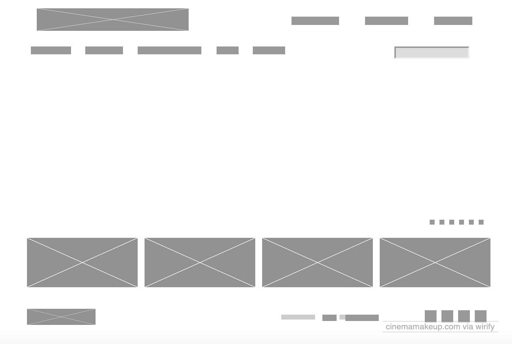
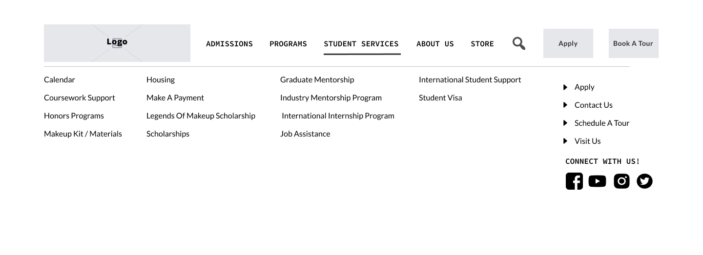
Final Lofi Solution
Final Mobile Menu
Final Desktop Menu
Final Desktop Landing
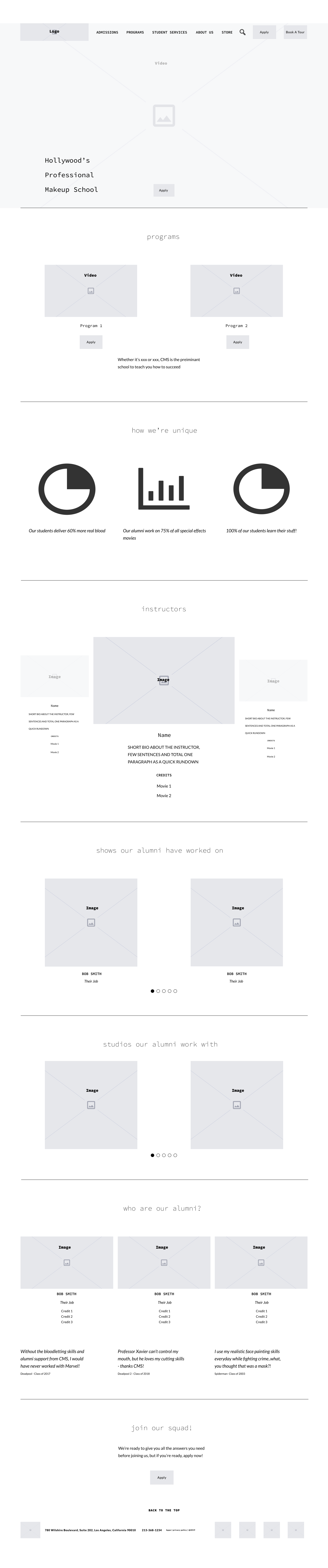
I only focused on the low-fidelity structure, so full redesign is still in process, as a specific visual designer was also hired to create brand specific artifacts. But the client was very excited with these designs.
They really loved the forward thinking for the mobile menu and data input. Several of their examples had a very dynamic visual videos on the landing, where readbility could be an issue. So I made sure our text readbility over any artifacts wouldn’t be an issue.
While the initial desktop menu addressed the structural needs, it didn’t resemble the exact design what they wanted. So that was rethought on a second pass, and I went back to their reference points. The next pass worked perfectly for the client.
Getting good client direction is incredibly helpful. When the desktop menu wasn’t up to snuff for them, they were able to be specific with what they wanted, making it easier to implement the desired changes.
Detail and brand knowledge created a sense of comfort for the client. Using their tested copy and adding new on-brand UX copy personalizes it more than lorem ipsum text. And putting their site address in the browser bar further solidified that feeling
5a
Final Site
Though implementation was slowed by the pandemic, the high fidelity visuals designed by Bill Green, finally went live here early in 2021.