Portal Design System
Enterprise design system for Riot's internal game management software tooling.
Problem Statement
Why do we need another design system?
Riot had a design system for players but lacked one for game management tools, despite having a strong developer culture and internal tooling.
Building and maintaining a design system demands significant time and resources, including planning, alignment, and goal-setting for scalability and long-term value.
Value Proposition
Players and developers have distinct goals and needs, a unified tooling design system could streamline development, ensure consistency across teams, reduce technical debt and reliance on external frameworks.
Required solutions
- Create a centralized, scalable design system that simplifies developer workflows.
- A experience that works across teams prioritizing dense and scannable data, increased build safety, with design support in place.
- Forward thinking system that might allow for all internal tooling to use one system, reducing maintentce costs by deprecating existing duplicate systems.
Audience
Who are the users?
Primary
Developers
- Primary users of the system for both teams.
- Often viewing large amounts of information in one place, requiring a balance of density and clarity.
- Elements require clarity of use and consistency to work across teams, while minimizing unnecessary customizations.
- Since developers typically work in code editors and GitHub, which are prone to errors, improving the workflow when transitioning to a new environment is essential.
Secondary
Non-technical Users
- Our team also needed to support less technical users.
- Includes product managers, QA engineers, producers, and designers.
- Often less comfortable with code editors and GitHub, we needed processes and UI that guide them through tasks without relying on a developer to assist, as was the current workflow
Project Roles
What did our team look like?
Multi Team Coordination
Both teams were already in flight on their respective projects, so combining workflows and sharing resources was the best way to complete the work, and achieve wider org value.
Team 1
- Product
- UX Designer
- 5 Engineers
- QA
Team 2
- UI Design Contractor
- 2-3 Engineers
Stakeholders
- Internal Tooling Teams (SDK, Commerce etc)
- Game Teams
- Player Platform Team Members (Designers, PM's, Developers etc)
Project scope
Aligned outcomes and workflows to achieve them
Goals
- Combine the design workstreams for the two portals, align them, make adjustments, and deliver the final work before the last 6 months of the UI designer's contract.
- Define a system of best practices and use cases for future use and implementation.
- Migrate our portal's existing designs to align with the updated system.
Notable pivot
Prior to completion, broader internal pivots and team changes led our partner team to scrap their project a few months later, stepping away from both their portal and the shared design system.
Approaching the work
We have limited resources, so let's divide and conquer
Riot was growing and had limited design representation at that time within their developer platform initiative.
The data scope for the other portal designer was more narrow and limited to their team. I was already handling all the design work for our portal, and had a broader view into cross-team requirements and systems across the org. He and I jumped into each other’s workflows to align, as to provide real value across initiatives, we needed to broaden out and add design flexibility for scaling.
My goal was to help guide the process, to broaden out the designs, and create standards around how we used and could implement the UI.
Starting Point
We assessed the work then built out a “to-do” list in figma to define:
- What was in place? Did it work as is, do we need to make tweaks or start from scratch?
- Where are the gaps that need to be bridged, and how do we do that?
- How do we create best practices with value and consistency to scale?
North stars guidelines
- Design for information density while retaining information clarity
- Improve on the code only experience in GitHub, using UI and contextual information to guide task completion.
- Provide guard rails against avoidable human errors that lead to costly breakages.
- And a “nice to have” that always came up, no matter who we talked to, was a design system that supported Dark Mode!
To Do Goals
Let's focus on scalable baseline patterns and methodology
UX Patterns
- Targeted adjustments to improve the ux experience on tables to make data more scannable, with standards around how different data is aligned.
- Rethink top navigation IA, to expand from a functionality from a single, to a multi-portal experience using a unified access point.
- Improve the menu UI experience and IA, so it's scalable and reduces friction for users.
Interface Updates
- Both designers viewed "Atomic Design" methodology as a key building block for the system, so we had a good starting point, though adjustments did need to be made to achieve more flexibility within the Figma nested component hierarchy.
- Designs were currently following a “kitchen sink” model to retain options and flexibility, but I needed to impart a point of view to create consistency and scalability. It would be overkill and time consuming to implement every option in place, and the amount of variables would make it harder to maintain best practice alignment in the long run.
- Because our needs and reach were broad, I started with our existing portal designs to identify use cases to serve as a bridge to wider requirements.
Implementation
- Simplify implementation by reducing and refining the UI from existing designs. This involved reducing the number fonts, buttons and colors, as well as identifying use cases for each element for an optimal experience.
- Create reusable patterns, and work with developers to create design and implementation documentation.
Digging into the designs
How did we deliver on the values we tried to attain?
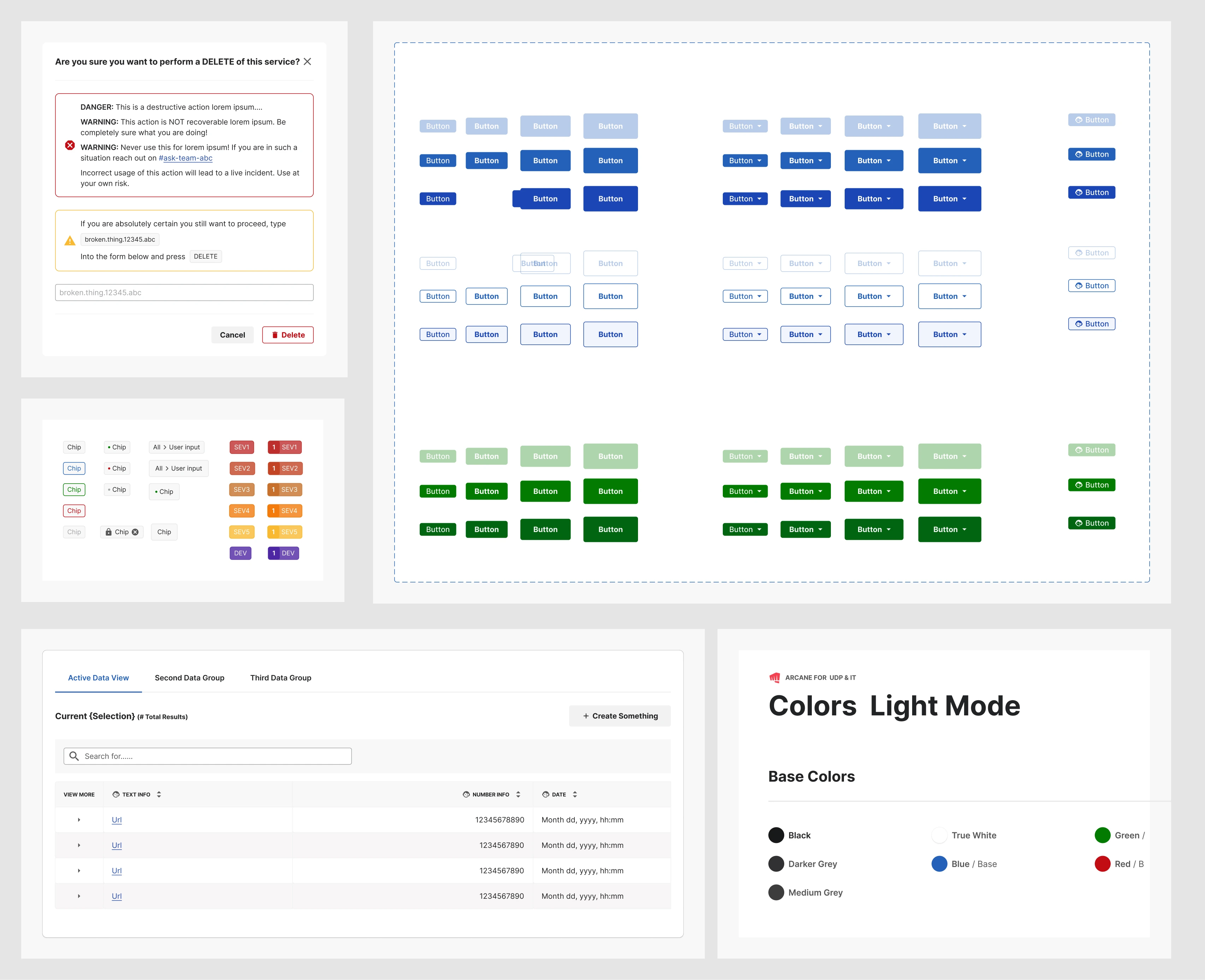
Information Density
These are data intensive workflows we were building towards, and needed to present lots of discernable content, which was also scannable.
Tables
- Tabs to create clear data groupings within a feature. Ex - tournament may have a tab for upcoming/in progress/completed tournaments.
- High level overview of current selection results at top of table.
- Search to quickly find data.
- Additional data available to view in a dropdown, when required.
- Left aligned text data for easy scanning.
- Right aligned number data for easy scanning.
- Create CTA always consistently on the top right and accessible without deterring from focus on current data.
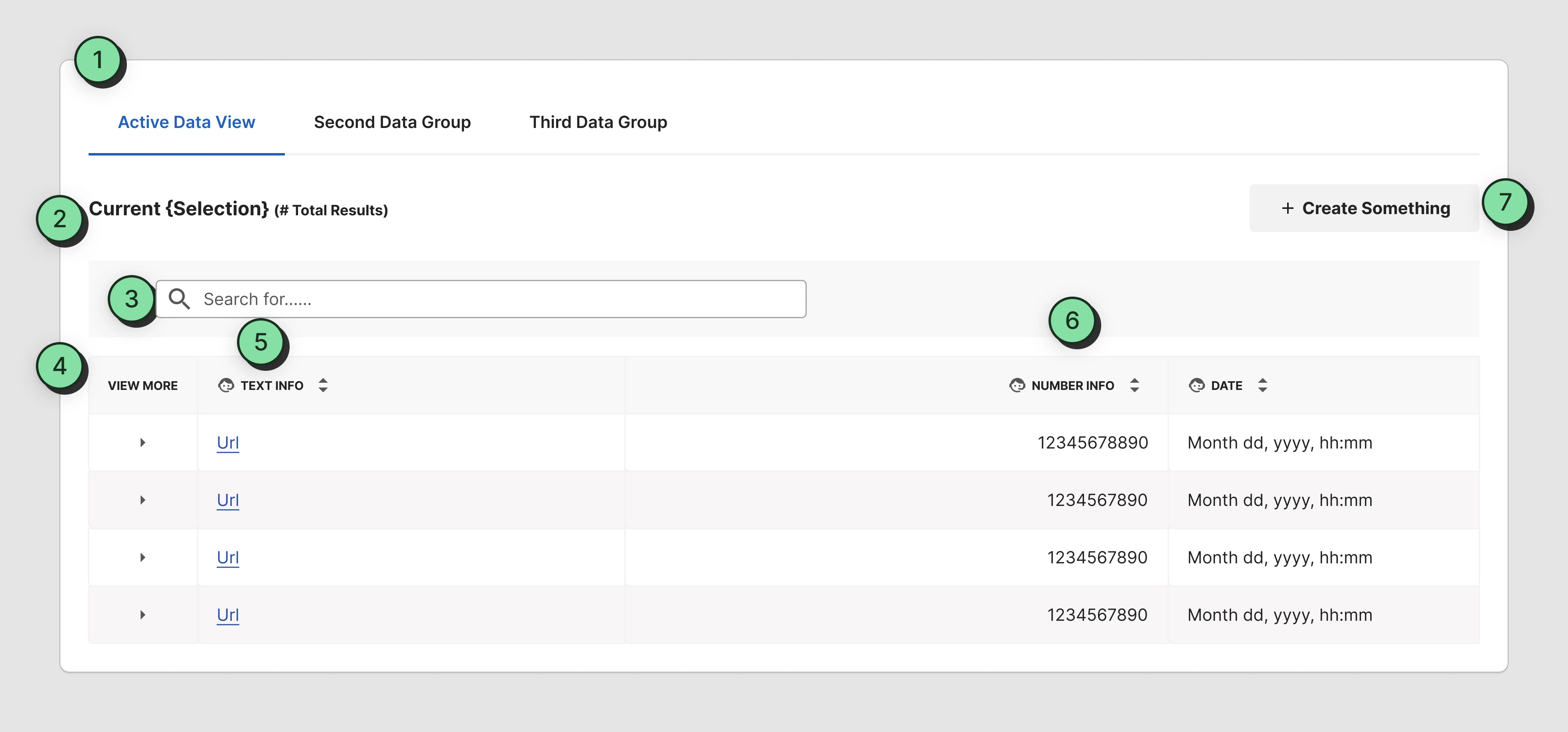
Safety & Error Reduction
We used modals, colors and intentional button placement create build guard rails around destructive actions. Where possible we wanted to try reduce human errors, such as accidental clicks, and “fat finger” inputs, or general “YOLO” accidents.
Destructive Actions
- Friction is often spoken about negatively, but is use protectively here, and thus beneficial in this scenario.
- Deletion might be the end goal, an accidental live incident is more problematic than additional pre-cautionary steps.
- Guided instructions pace the process while providing context around destructive actions.
- Using an outlined button with red and an icon for a destructive action, reduces emphasis while retaining action clarity.
- The "type to confirm" code is modeled after destructive action prevention in github.
- Clear cause and effect and instructions provide next step guidance.
Usability & Scalability
This project was key to growth of the company, so we we needed to build a framework accounting for future features.
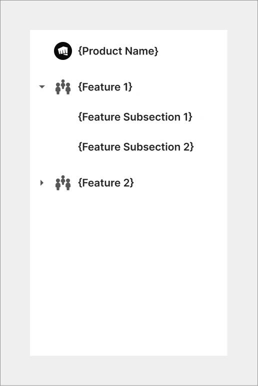
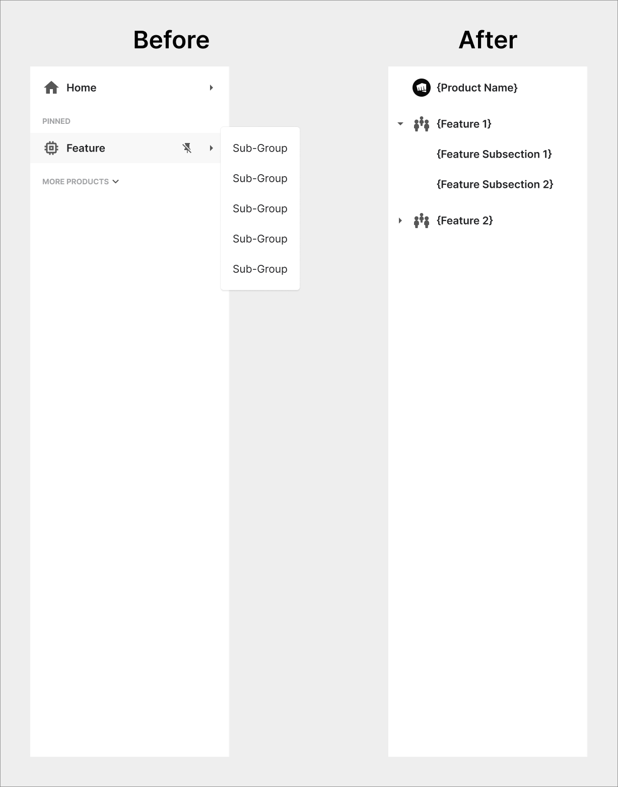
Menu Navigation
- Some comp analysis went multiple levels deep, but we felt that didn't match our needs and could users could lose track of their where they were in content. Nesting content went one level deep to maintain future scalability.
- We avoided forcing users to hover over an item to see more feature content, as that could cause frustration should the UI change with small mouse movements.
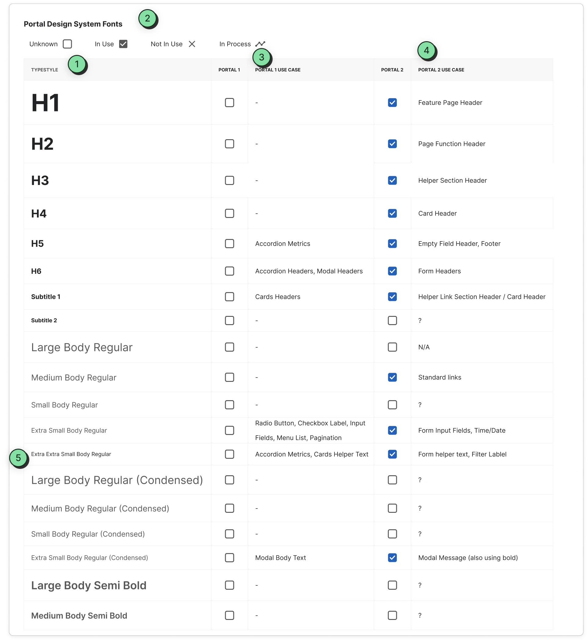
Typography
- "Inter" provided the needed information density and clarity, but with fewer variations to improve implementation.
- A grid tracked the fonts in use and their locations, helping identify what needed to be replaced or removed.
- Font usage locations were identified, with additional research on other internal portals (not shown here) to lay the foundation for future alignment.
- The designer handling the broader typography system to make adjustments was brought in to gather suggestions, and ensure alignment.
- We reduced alternate weights, simplified the headers, and streamlined the design. Her recommendations helped maintain alignment, establish standards, and prevent over-implementation.
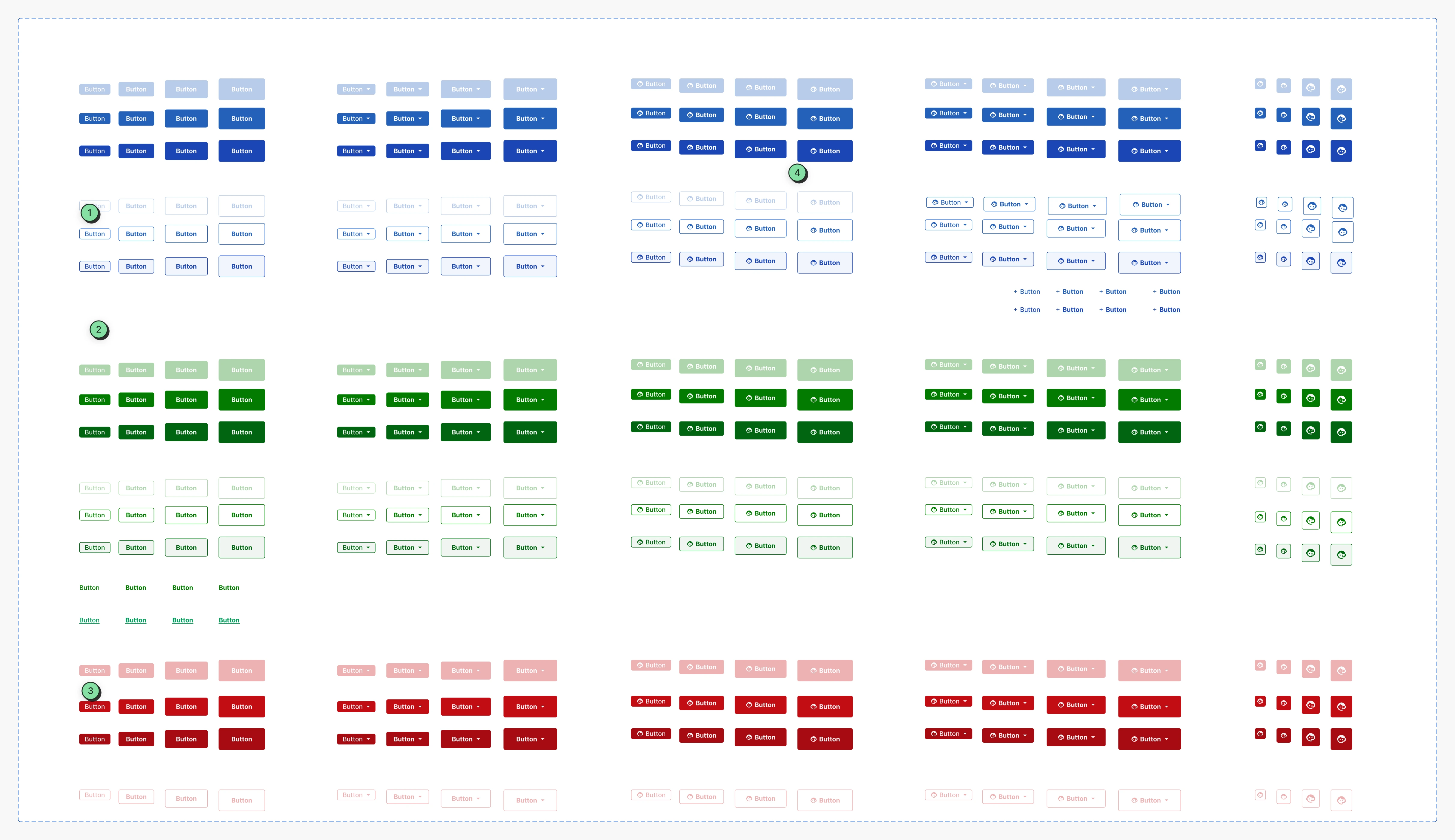
Buttons
- For the MVP, we settled on two sizes, action-based colors (red, green), and two generic colors (blue, black). Colors were adjusted for accessibility, aiming for a balance between AA and AAA standards, as the latter could be too restrictive.
- Users should be able to see all options, even if inactive, so adjustments were made to achieve that.
- "Ghost buttons" were replaced by regular link text.
- Text-only or icon-plus-text options met most of our needs, while also adding limited use of a dropdown version for controls.
Wide Screen Content
Content Focus on wide screens
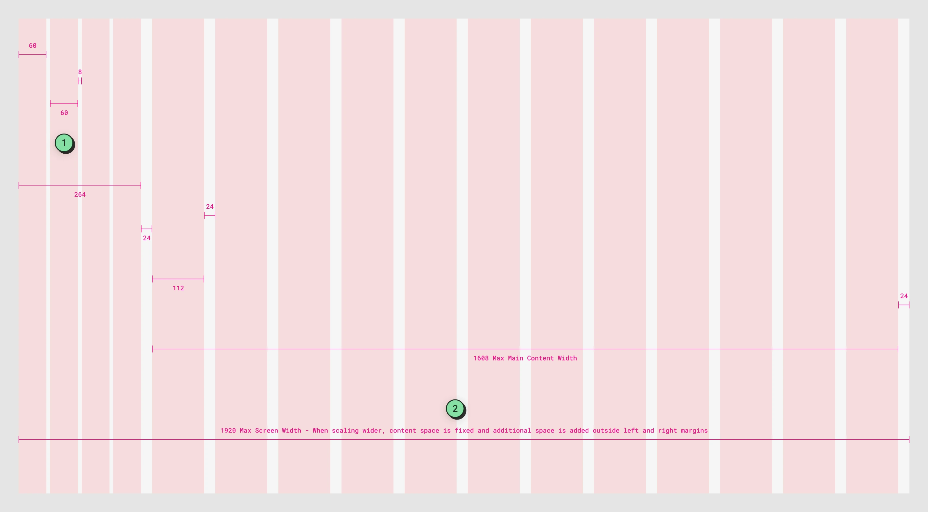
- Grid columns were used to create consistent spacing between elements allowing for readability without being cramped.
- Devs often have large screens. Content unfurling infinitely to the right as screens got wider, decrease usability, so I standardized maxing out at 1920 then centering content.
Top Navigation Bar
Revamping the top navigation and user settings improved clarity and enabled an access-based system for Rioters to reach all their portals from one location.
Nav Bar
- The layout was initially designed for 1920+ screens, so I improved the usability by re-engineering it to align with our existing grid system, which included smaller standardized screens like laptops.
- We created a hub for multiple portals, with a top navigation for access and a portal switcher on the left to change between them.
- Search evolved from an MVP to a future goal as the scope expanded to include multiple portals, due to the complexity of cross-product search functionality.
- Team access was included in a product dropdown, alongside account settings and a help function (the latter as a placeholder for future features).

Multi-Team Access Point
Product Access Dropdown
Transitioning from a single to a multi-portal setup required rethinking top level feature organization.
- Product identification remained the same.
- Team name was simplified.
- Team management was moved to the main menu alongside our access management feature.
- The search feature was removed as it felt redundant and potentially confusing with the larger search functionality in the top navigation.
- The favorites list, requested by the other portal, was deemed a fringe use case and was removed.
- The help link was removed, with the static help in the top nav now covering this use case.
- Current products and access requests followed the "guide, not hide" UX pattern to enhance discoverability.

Menu Navigation
Scale with less friction
- Initial plan was hover to view more options.
- Accidental mouse movement could change what is being presented and cause friction. So we we pivoted to expandable, nested content that went one level deep.
- This improved usability, while still being scalable.
Pairing with devs
Building a scalable "source of truth" documentation method was in progress across teams. As a small, fast-moving team, clear Figma instructions sufficed for the short term.
Handing off work
- Detailed Figma annotations.
- Async Slack threads were used for quick questions, which could lead to ad-hoc sync meetings.
- Standing meetings to walk through designs, and answer larger questions.
- We used a test environment to review in-flight designs along with the QA lead, and developers to address any issues.
Naming Conventions
Long-term naming convention alignment was crucial to bridge Figma and code.
By aligning with developers and understanding their perspective, we chose the BEM methodology which follows similar conventions as our atomic design system
Did it work?
Following this approach allowed us to release the MVP, enabling users to discover and use the features. As it was a new process, we spent time walking users thorugh things, answering questions, and gathered feedback for improvements.
Final Thoughts
Broad project results
- The launch of our portal MVP also introduced the design system, both of which received positive user feedback.
- Developers noted the simplicity and consistency within the interface, and workflow error reduction.
- We began obtaining feedback, and planned to implement metrics to make additional improvements.
- Partner teams could begin using our system and Figma templates, which allowed their designers to more quickly visualize designs.
- More fleshed out documentation was still in flight, so we provided helpful guidance to them around patterns to follow.
Post-project reflections
UA few months later, we faced issues that led us to abandon our custom UI in favor of an external framework. Builds began breaking due to inconsistent implementation, caused by reduced manpower and insufficient documentation.
While there was documentation in Figma, it may not have been sufficient. The company later adopted Notion, which became a better collaborative space for cross-discipline documentation.
Documentation in Figma was compounded by our decreased resources that also led to our inability to implement the BEM naming conventions.
Fortunately, all our UX work was validated. Despite switching to an external UI framework, core UX processes like enhanced guardrails for safer development and improved data scannability remained intact.
Project Coda
Building a design system with shared resources between two teams with different priorities proved more challenging than if a single design team had handled it.
I'd like to think based on the initial launch feedback, improved communication and alignment could have changed the eventual outcome.
Ultimately, despite a valid effort to create internal value, frequent changes in broader road-maps hindered our ability to complete continue progress on our custom design system.