Riot Account Management 2.0
About Riot
Legacy systems can become overly expensive to maintain and complicate creating new, best in class user features. To bring align the needs of Riot's players and business goals,
I used deep research and insights for a scalable path forward for a format simultaneously improving the user experience and operation costs.
Project Overview
Challenges with the current system?
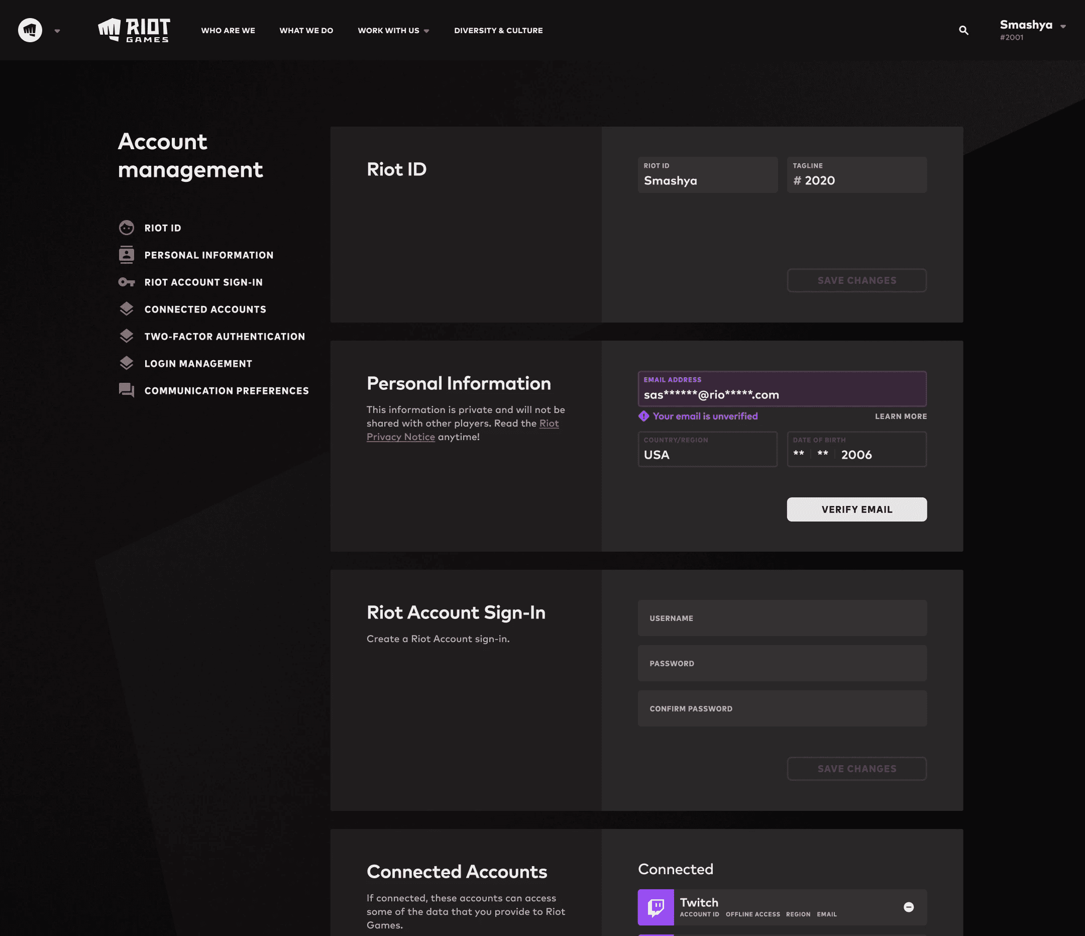
Account Management features were built vertically, a single page with every service being called whenever a user visited that page. This was due to lots of legacy code and became increasingly cumbersome.
The vertical structure was inefficient, expensive, and a headache for our engineers. Features lacked any organization reflecting user goals. The experience on mobile devices were odd and had usability issues. Without addressing the core problem (overall architecture) we'd repeat the same frustrating cycle.
Redesigning the entire structure NOW, was a path to creating a net positive for both user goals and the business bottom line. It would reduce costs and unlock new feature capabilities.
Project Overview
Problem Definition + Scoped Solutions
This was a complicated project around live features, requiring cross team-alignment to minimize scope bloat.
By focusing solely on structural changes that lay the groundwork for broader updates, I was able to make the unmanageable, more manageable for our engineering partners.
Challenge
Redesign the structure so it’s more cost efficient and scalable
Align the structure around best practices and user needs
A responsive experience more naturally aligned across devices
Improve the mobile usability
Define scope to allowing for iterative implementation over time, to maximize results while minimizing user friction and engineering complications.
Problem + Scope Definition
Planning out complicated changes with live features
Market Research
Solutions via research to understand how comparable products organize their features
User Research
Assessing the expectations of our users
Final Aligned Updates
The updates seem subtle, but that was the point, given this a live service with a lot of dependent logic that had become increasingly entangled over time as the company and it's offerings grew. Sometimes the most valuable work is less seen on the outside, because it's so subtle.
The new structure would allow us to make small, but important and targeted changes that with minimal user confusion when features were moved. It would also reduce operating costs, and improve scalability.


Simple but powerful updates
This new structure as simple as it was, also took into account being more closely tied to the mobile experience.


Improved Mobile Experience
We removed confusing UI, added better indicators that made it easier for users to understand where they were and what section they were navigating to, with a subtle enough update that would be noticed without confusing the users.


Final Outcomes
What was the final result?
I had unique insights into the value of tackling this project, due to my experience on the developer platform. That knowledge highlights that the longer companies put off making their systems efficient and scalable, the more challenging and expensive that work becomes.
Due to the considerable effort and alignment required to deconstruct, then rebuild the entire system, there were incredible challenges to fully complete this project, and design completed several quarters ahead of implementation.
Once released this will be a mutually beneficial outcome to both player experiences and the company bottom line. Not only with usability and reduced API costs, but handling those will unlock the companies abilities to more efficiently build experiences that increase player value.
