0-1 Enterprise Design System

Product TLDR
MVP Enterprise SaaS design system for internal game management tools at Riot Games, creating a safer workflow and improving developer efficiency by designing solutions informed by the needs of developers.
#1
Lower Costs + Improved Scalability
#2
Faster + Safer Deployments
#3
Dense + Scannable Information
Project Overview
Why would developers benefit from their own design system?
Value Proposition
Players and developers have distinct goals and needs, and Riot had a player facing system, but not one for internal tooling. A unified tooling design system could streamline development, ensure consistency across teams, reduce technical debt and reliance on external frameworks.
Objectives
Create a unified design language speaking to the needs of our specific user base
Reduce design + technical debt across silos
Standardize workflows for faster deployments
Accommodate dense information for power users
Support both technical and non-technical user personas
Scale to support future internal tooling across Riot
Maintain developer confidence (safety patterns)
Project Process
Context + Goals
Riot never had a standardized internal design system, and as a bottom up org, where workflows often were silo'd, multiple teams would spin up their own resources. Maintaining multiple design systems across organizations over time becomes increasingly costly and unscalable, despite having related user needs.
Our approach was guided by four core design principles. Rather than imposing top-down standards, we researched each team's unique constraints and built components that satisfied shared needs while allowing customization where needed.
Scalability
How do we build once to serve multiple teams?
Information Density
How to show complex data heavy interfaces without overwhelming users?
Safety & Trust
How to make developers feel confident making changes?
Delivered Outcomes
Scalability
These components enabled teams to build consistent interfaces quickly.
Semantic Color Token System replaced hardcoded colors with meaningful intent-based tokens (primary, secondary, success, danger, warning). Teams customize the color values as needed, not the component logic.
Buttons for different but related use cases (primary, secondary, danger, disabled, loading), providing visual consistency without duplication
Grid-based card component enabling rapid page composition. Consistent borders, shadows, spacing, and hover states.
Streamlined typography with heading hierarchy (H1-H4) and body/caption type scales, inclucing line-height and weight rules, for consistency at scale.
Core Icon Library (save, delete, settings, warning, etc.) in consistent stroke weight and size to support common developer actions.


Information Density
These components helped developers display and interact with complex data.
Component: Dense Table Purpose: Optimized for high-row-count datasets. Sticky headers, sortable columns, filterable cells, pagination. Prioritizes information over whitespace.
Component: Collapsible Section Purpose: Progressive disclosure. Show summary by default, expand on click for details. Reduces cognitive load without hiding information.
Component: Multi-Select Filter Purpose: Complex filtering for large datasets. Users select multiple criteria, see results update in real-time. State persists per user.
Component: Severity / Status Badge Purpose: 5-level severity system (Dev, SEV1-5) using color + icon + text. Makes priority obvious at a glance.
Component: Data Summary Card Purpose: Show key metrics (count, average, percentage change). Used in dashboards for quick scanning.


Safety & Trust
These components helped developers feel confident and in control.
Visually distinct button styling making risk obvious.
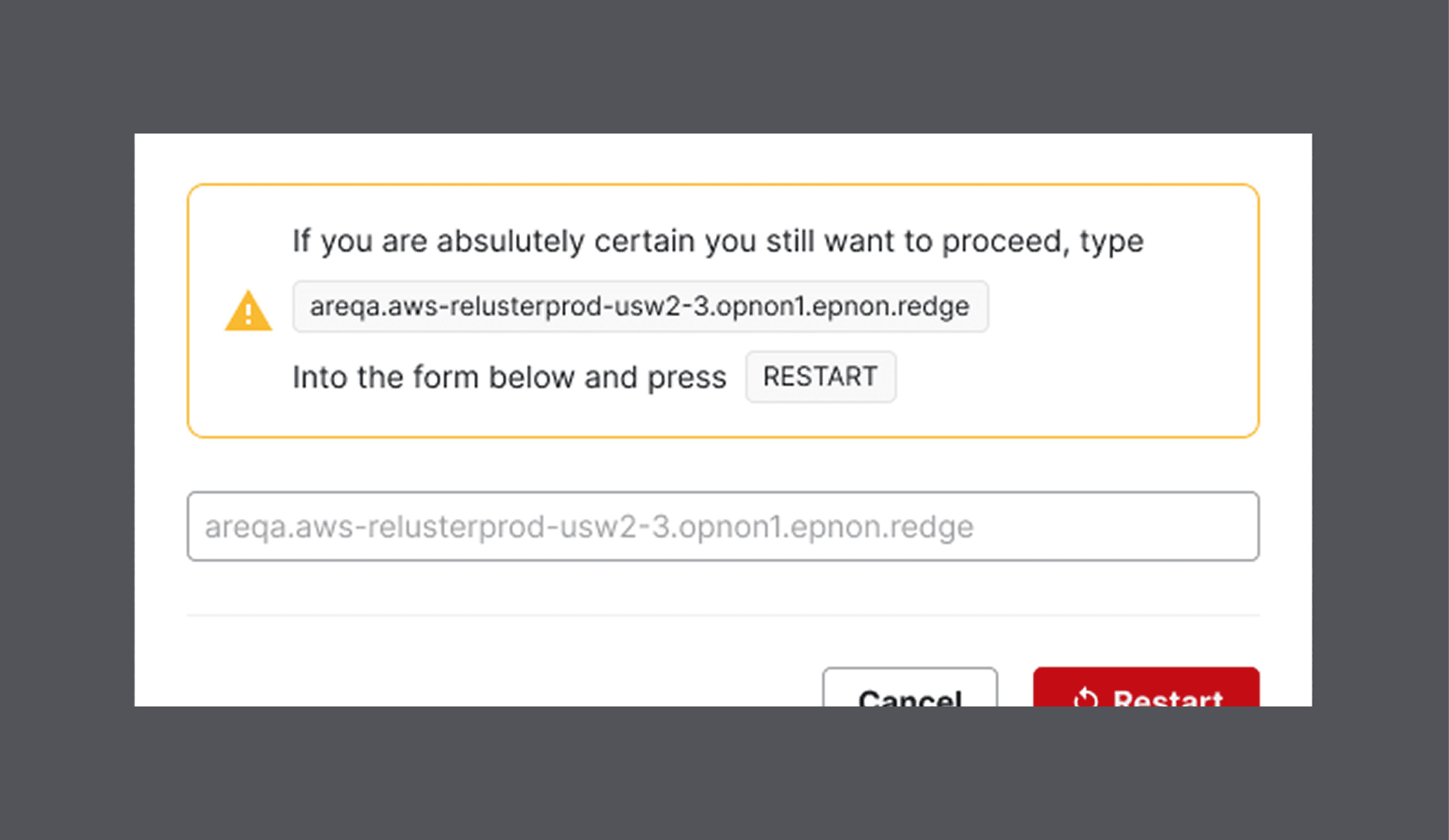
Informative confirmation dialog/modals for destructive actions to reduce errors.
Reducing accidental deletions following Github "type to confirm" patterns.
Disabled form fields when actions aren't allowed, and descriptive tool tips.
Sortable history of actions on a resource, helpful for retracing prior actions.


Final Outcomes
What was the result?
The launch of the design system was an initial success, but shortly after all the hard work was forced to be removed for an out of the box option.
The project started as a two team collaboration, though one quietly pulled back mid project.
Fewer resources led to inconsistent UI implementation, resulting in constant build breaks.
Despite our best efforts, by the time the problems were identified, it became less work to use an external framework than fix all the existing problems.
Despite replacing the custom UI with an external framework, we were able to retain the "How & Why" patterns that provided safety, trust, and information density required for our workflows.
